


Don’t Always Trust Regression and Correlation in Finance: Here’s Why
Common pitfalls and fallacies in financial data analysis

Time series data refers to information collected over different time intervals, as opposed to data that capture a single snapshot of events, measurements, or phenomena. It is commonly used to analyze trends in stock markets, track population changes, monitor weather patterns, and examine product performance over time.
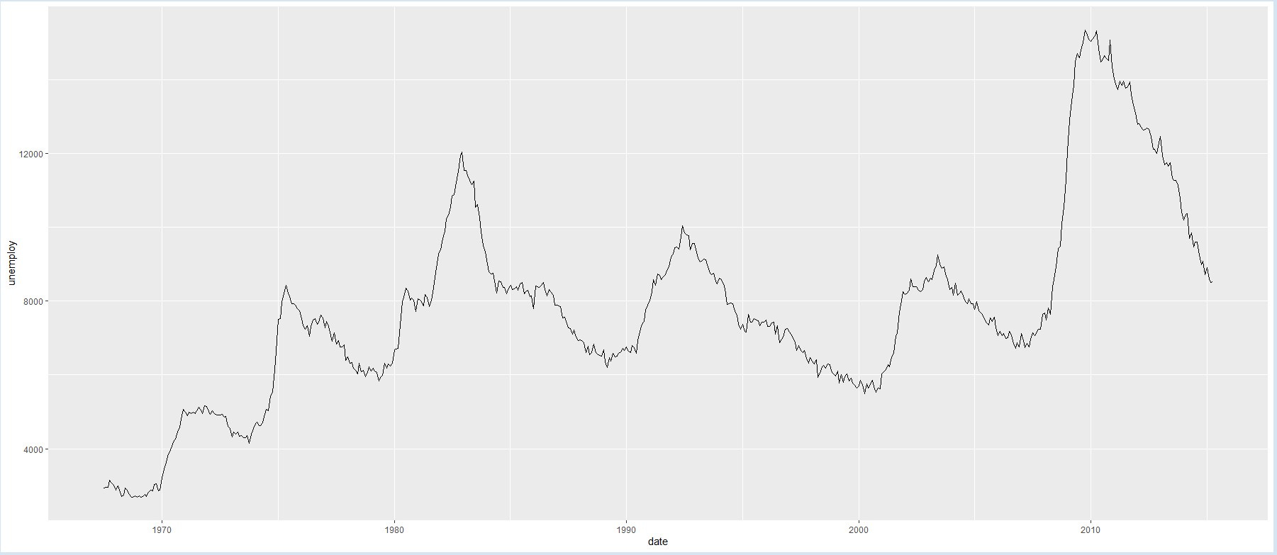
TIME SERIES EXAMPLE: unemployment rates in the US from 1948 to 2016
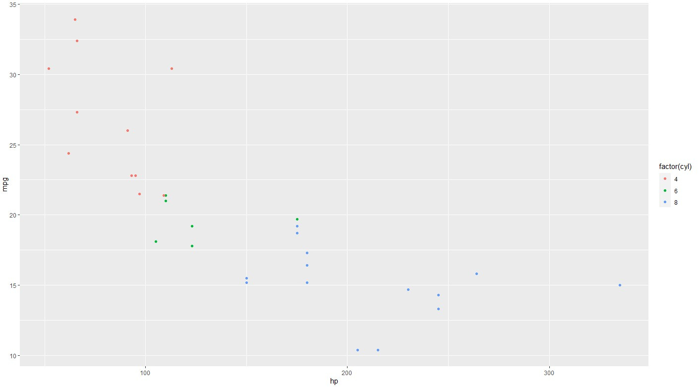
NON-TIME SERIES EXAMPLE: miles per gallon and the horsepower of the cars (it colors the points by the number of cylinders)
Regarding financial analysis and investments, two of the most used statistical tools are regression and correlation.
-Correlation measures the strength and direction of the linear association between two variables, without implying any causation. It has a value between -1 and 1, where -1 indicates a perfect negative correlation, 0 indicates no correlation, and 1 indicates a perfect positive correlation. For example, the correlation between height and weight is positive, meaning taller people tend to weigh more on average.
-Regression measures the effect of one variable on another and aims to find the best equation that fits the data and minimizes the error. The equation “predicts” the value of one variable (the response) based on the value of another variable (the predictor).1
However, they rely on some assumptions that may not hold for time series data.
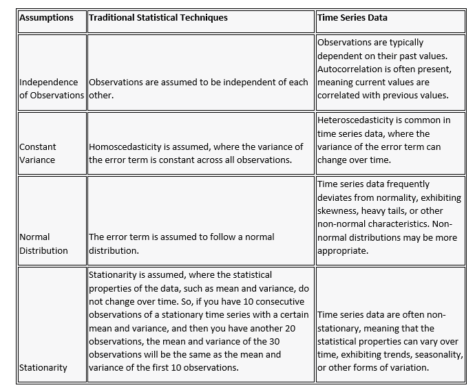
When applying regression analysis, autocorrelation can increase the variability and unpredictability of the data, so ignoring autocorrelation can lead to misleading results and false assumptions.
This can be shown for example by the behavior of stock price time series, which exhibits a high level of autocorrelation in daily returns and a broader-than-expected distribution of annual returns under the assumption of independence and normality. Autocorrelation can amplify the effects of random shocks and lead to persistent patterns in the data, which, in turn, can contribute to fat tails. These features are not captured by regression models which can't account for autocorrelation, creating a false impression of safety or stability.
On the other hand, a non-stationary issue could be highlighted by another example: the 60-40 investment strategy assumes that stocks and bonds have an inverse correlation, meaning that they tend to move in opposite directions.
This assumption implies that bonds can provide diversification and stability to a portfolio when stocks are volatile or declining. However, it may not always hold true, especially when both stocks and bonds are affected by common factors, such as inflation and interest rates.
In this case, the weak point of the 60-40 strategy is that it may not offer enough protection or return for investors.
The non-stationary of the time series of stocks and bonds is one of the factors that can challenge the inverse correlation assumption. This means that the relationship between stocks and bonds may not be constant or predictable over time, and may depend on the economic and market conditions.
For example, in some periods, stocks and bonds may have a positive correlation, meaning that they move in the same direction, while in other periods, they may have a negative correlation, meaning that they move in opposite directions.
Let me share with you one final example, possibly the most important: Alfonso Peccatiello's article on 'The Liquidity Illusion'.

Is it really true that ‘’liquidity’’ is so tightly correlated to stock market returns?
We ran a simple linear regression analysis between the change in ‘’liquidity’’ (US bank reserves) and the S&P500 returns in the last 15 years – we played around with time lags, outliers, return windows...everything.
Bank reserves and stock markets both tend to go up over time and hence they look ‘’correlated’’, but analysing the rate of change of liquidity and S&P 500 returns helps with smoothing this problem away.
The result was consistently clear.
A simple linear regression exercise tells us ‘’liquidity’’ is pretty bad at predicting stock market returns: as shown by the R2 data, in the last 15 years US liquidity only explained 3-4% (!) of the variation of SPX returns.
So, yes: both series trended up over time and plotting them on a dual-axis chart looks great but stocks go up over time because earnings grow and not because Central Banks pump ''money'' in the ''system''.
Money in this case means bank reserves, and banks can’t and won’t use reserves to buy stocks - the direct relationship and simple narrative suggested by mainstream macro commentators…
…simply doesn’t exist.
I don’t have the same certainty as he does regarding the reciprocal influences of liquidity and equities, albeit indirect, but it is clear that when you eliminate the trend in the two series using a simple differentiation between successive observations, the relationship between them is not as straightforward as some might suggest.
When analyzing time series data, it is important to start by carefully examining the recorded data displayed over time. This visual inspection helps in selecting appropriate analytical methods and statistical measures. Time series graphs plot the observed values on the y-axis against time on the x-axis. These visual representations reveal behavioral patterns, such as a mean-reversion or explosive behavior, the presence of a time trend, seasonal patterns, and structural breaks in the data.
This initial analysis, coupled with appropriate statistical tools, helps in understanding and modeling the data effectively, despite the deviations from traditional statistical assumptions.
Granger causality aims to test whether the past values of one variable can improve the prediction of the future values of another variable, assuming a causal relationship. It can be used to infer the direction and significance of causality. Granger causality is limited to lagged and linear effects while regression can capture instantaneous.